Customer Attrition Starts Earlier Than You Think – Here’s How to Spot It. This guide shows how to predict customer attrition using behavioral data and turn early warning signals like falling visit frequency, missed bookings, and payment failures into production-ready scores and automated interventions. You will get concrete SQL snippets, modeling and evaluation templates, and intervention playbooks to run a 30-day proof of concept.
Customer Attrition Starts Earlier Than You Think — Here is How to Spot It
Signal, not event. You will typically see customers drift long before they cancel – a falling rhythm of visits, fewer app opens, more booking cancellations, or a slipped payment attempt. Those micro behavioral changes form the earliest, most actionable inputs when you want to predict customer attrition rather than wait for a termination event.
Practical trade-off. Chasing every tiny dip raises false positives and wastes marketing budget; using only coarse rules misses early exits. The pragmatic compromise is a hybrid signal: require a relative decline (for example, at least a 40 percent drop versus the prior period) plus one corroborating event (failed payment, support ticket, or push-open decay) before flagging high risk.
Concrete SQL: detect two-week consecutive decline in active sessions
Use a rolling count per week and compare the last two weeks to the prior two. This example (BigQuery-style) produces a boolean decline_2wk you can join into features or triggers:
WITH weekly AS (
SELECT
user_id,
DATETRUNC(eventdate, WEEK(MONDAY)) AS week_start,
COUNTIF(event_type = session) AS sessions
FROM project.dataset.events
WHERE eventdate >= DATESUB(CURRENT_DATE(), INTERVAL 90 DAY)
GROUP BY userid, weekstart
),
ranked AS (
SELECT userid, weekstart, sessions,
LAG(sessions,1) OVER(PARTITION BY userid ORDER BY weekstart) AS prev_week,
LAG(sessions,2) OVER(PARTITION BY userid ORDER BY weekstart) AS prev2_week
FROM weekly
)
SELECT userid, weekstart,
(sessions < prevweek AND prevweek < prev2week) AS decline2wk
FROM ranked;
Limitation to watch. Small-sample users produce noisy week-over-week signals. Apply a minimum activity floor – for instance, only evaluate decline patterns for users with at least three sessions in the prior 30 days – or smooth counts with an EWMA to reduce churn in the signal itself.
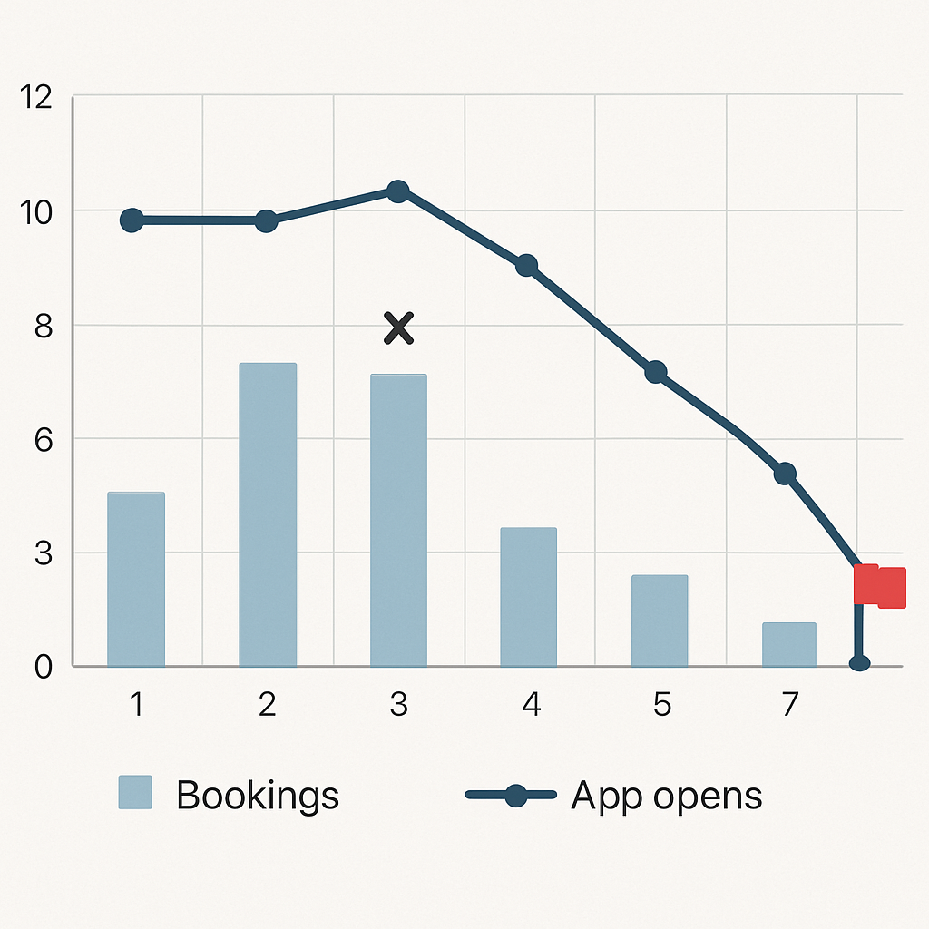
Concrete example: A boutique fitness club tracked a member who fell from three bookings weekly to one, app opens dropped by 70 percent, and a card auto-charge failed one week. The two-week decline rule fired, the member received a coach outreach and a targeted offer, and attendance returned the following month. That one case cost less than a single lost membership versus waiting for cancellation.
- What to combine with a decline rule: failedpaymentscount, pushopenrate14d, bookingcancels_30d
- Why relative measures beat absolutes: they detect decay even for high-frequency users who still have above-zero activity
- Calibration tip: choose thresholds based on precision at top k so you treat only the highest-value, highest-confidence cases
Common misjudgment. Teams often assume recency alone is sufficient; in practice, recency is a blunt instrument and misses momentum. Momentum – the slope and persistence of decline – separates temporary lapses from structural attrition. Model or rule design should prioritize momentum features if your goal is early, reliable warning.
Key takeaway: spot attrition by combining relative declines in behavioral rhythm with corroborating signals (payments, support, engagement). Tune thresholds to marketing capacity using precision-at-k, not global accuracy.
Next step. Once you can reliably surface two-week decline patterns, fold that boolean into your feature store or CDP segmentation and map risk buckets to concrete interventions in your orchestration system. If you use Gleantap, sync the flagged segment directly to a journey for automated outreach and A/B testing; see Gleantap features for orchestration options.
Define Attrition for Your Business and Choose a Labeling Strategy
Start with the label, not the model. The single highest-leverage decision you will make when you set out to predict customer attrition is how you define the positive class. Customer Attrition Starts Earlier Than You Think — Here’s How to Spot It applies only if your label captures the earlier window you want to act on; otherwise your model will learn to predict cancellations, not prevent them.
There are four practical labeling patterns you will choose from: explicit cancellation events, contract nonrenewal, fixed inactivity window, and transaction absence. Each maps differently to revenue, operational cadence, and noise. Choose the label that matches how you measure revenue and how quickly you can execute treatments.
Decision matrix to pick a label
| Business model | Label candidate | When to use | Primary trade-off |
| Monthly membership (fitness clubs) | No visits for N days + no payment on renewal | When you need alignment with billing and coach outreach | Good signal-revenue alignment but requires payment data |
| Pay-per-visit (family entertainment) | No visits for 60-90 days | When visits drive lifetime value and cancellations are rare | Earlier detection but higher false positives for occasional customers |
| Class subscriptions (wellness studios) | Missed consecutive renewals or N missed bookings | When class cadence and booking behavior predict churn | Captures momentum but needs booking logs |
| Retail loyalty | No transactions in seasonal window (e.g., 6 months) | For businesses with clear seasonality | Balances seasonality vs label freshness |
Practical rule example: For a monthly membership, a robust operational label is: label = 1 if visitslast60days = 0 AND autopaymentfailedormissinginnext30_days = true. This pairs behavioral inactivity with revenue signal so treatments target customers you can realistically retain.
A critical limitation: shorter labeling windows (0-30 days) increase signal timeliness but inflate false positives and class imbalance. Longer windows produce clearer positive examples but delay interventions until risk is already realized. Match your labeling horizon to campaign cadence — daily scoring needs shorter labels; quarterly retention programs can use longer windows.
Avoid leakage. Never include events that occur after your label window as input features. Using post-label actions (refunds, late cancellations) in training will inflate offline performance and break production behavior. Build your feature assembler with a strict cutoff timestamp.
Key takeaway: Pick a label that ties to revenue and treatment capability. If you can act before billing, favor a behavior+payment hybrid; if you cannot, use contract milestones. Then validate labels with backtests showing whether interventions executed at that label would have changed outcomes.
Next consideration: map your chosen label to the feature lookback window and your temporal validation plan so that training data, scoring cadence, and campaign timing are aligned before you train any model. For orchestration, sync the labeled segment into your engagement tool such as Gleantap features so predictions trigger treatments without manual translation.
Collect and Instrument the Right Behavioral Signals
Start with the signals that actually move the needle. Customer Attrition Starts Earlier Than You Think — Here’s How to Spot It, but you cannot act on early warnings unless those micro-events are captured reliably, consistently, and with stable identifiers.
Which events matter most. Capture event types that reveal rhythm and friction: sessionstart, bookingcreated, bookingcancelled, purchase, paymentattempt, paymentfailed, emailopen, pushopen, supportticket_created, and loyalty or membership state changes. Record these at the source rather than trying to infer them later from aggregated reports.
Minimum event schema (practical and production-ready)
Instrument a compact, consistent payload every time. Include userid (hashed), eventtype, an ISO 8601 timestamp, sourcesystem, locationid where applicable, amount for monetary events, and a meta map for optional attributes like classid or paymentgateway. Below are two concrete JSON payloads you can copy into your ingestion layer.
Class booking example: {userid:hash:abc123,eventtype:bookingcreated,timestamp:2026-02-20T14:05:00Z,sourcesystem:bookingservice,locationid:studio7,meta:{classid:spin60,instructorid:i42,pricecents:2500}}
Failed payment example: {userid:hash:abc123,eventtype:paymentfailed,timestamp:2026-02-21T04:12:00Z,sourcesystem:payments,locationid:null,amountcents:4999,meta:{paymentmethod:card,failurecode:insufficientfunds,attemptid:pay_987}}
Operational trade-offs you will face. Raw event capture is ideal for feature engineering but increases storage, pipeline cost, and data-quality surface area. Aggregating everything into summary tables reduces cost and latency but destroys sequence information and subtle momentum signals. Pick a hybrid: stream raw events for a representative sample or VIP segment and write daily aggregates for the full base.
Integrity considerations that matter in practice. Enforce consistent userid resolution across systems, normalize timestamps to UTC at ingestion, deduplicate events by an eventid, and version your schema. Most production failures I have seen come from missing payment_webhook events and inconsistent location mapping — build automated checks to detect gaps early.
Consent and minimization. Avoid sending PII into analytics. Hash identifiers, strip unnecessary personal fields from the event payload, and record consent status with each event so you can honor GDPR/CCPA requests without breaking feature pipelines.
Concrete example: A regional family entertainment center added booking_cancelled and a lightweight WiFi checkin event tied to hashed device IDs. By joining those events to POS receipts they detected declining visit velocity two weeks earlier than before and reactivated high-value families with targeted weekend bundle offers, increasing short-term visits without broad discounts.
Practical judgment. Instrumentation is not an all-or-nothing exercise. Start with the handful of signals that historically correlate with loss in your vertical, validate predictive lift, then expand. Use Gleantap features or your CDP to centralize events and feed both real-time scoring and daily aggregates. For implementation patterns, see the BigQuery churn tutorial for sample ingestion and modeling pipelines.
Key takeaway: Prioritize correct, versioned payloads for a small set of high-value events, enforce id and timestamp hygiene, and balance raw capture with aggregated storage to control cost while retaining early-warning fidelity.
Feature Engineering and Early Warning Signals
High-impact rule: good features detect decay before a cancellation is filed. Customer Attrition Starts Earlier Than You Think — Here’s How to Spot It, and the only practical path from early warning to prevention is a focused set of features that capture momentum, friction, and value — not a long laundry list of raw events.
Feature families to prioritize: count-based rhythm, short-term velocity, engagement ratios, friction signals, monetary value, and interaction features that expose changing behavior relative to a user baseline. Build each family with a clear business question: is activity falling, is engagement eroding, or is a payment incident increasing risk?
Prioritized feature list (copyable names)
- Recency / baseline: lastvisitdays
- Counts (multi-window): visits7d, visits30d, visits_90d
- Relative momentum: pctchange30dvsprev30d
- Payment friction: failedpayments90d
- Monetary signal: avgspend30d
- Engagement rate: pushopenrate_30d
- Velocity / gaps: mediandaysbetweenvisits90d
- Decay weighted: ewmvisits60d (exponentially weighted)
Practical trade-off: heavier features like ewmvisits60d and interaction terms improve early detection but require either online feature serving or nightly recomputation, which increases engineering cost. Start with daily-aggregated counts and one momentum metric, then add decay weights once you have stable IDs and a feature store.
SQL example: visits_30d and percent change vs prior 30 days
Use a single query to produce both current-window and prior-window counts and a safe percent-change. This BigQuery-style snippet is production-friendly and intentionally avoids division-by-zero errors:
WITH visits AS ( SELECT userid, eventtimestamp FROM project.dataset.events WHERE eventtype = visit AND eventtimestamp >= TIMESTAMPSUB(CURRENTTIMESTAMP(), INTERVAL 180 DAY) ), agg AS ( SELECT userid, COUNTIF(eventtimestamp >= TIMESTAMPSUB(CURRENTTIMESTAMP(), INTERVAL 30 DAY)) AS visits30d, COUNTIF(eventtimestamp >= TIMESTAMPSUB(CURRENTTIMESTAMP(), INTERVAL 60 DAY) AND eventtimestamp < TIMESTAMPSUB(CURRENTTIMESTAMP(), INTERVAL 30 DAY)) AS visitsprev30d FROM visits GROUP BY userid ) SELECT userid, visits30d, visitsprev30d, CASE WHEN visitsprev30d = 0 THEN NULL ELSE SAFEDIVIDE(visits30d – visitsprev30d, visitsprev30d) END AS pctchange30dvs_prev30d FROM agg;
Limitation to manage: small-sample users will create extreme percent-change swings. Resolve this by applying a minimum-activity floor (for example, compute pctchange only when visitsprev30d >= 2) or use NULL and treat missing momentum as low-confidence in downstream scoring and campaign selection.
Concrete example: A wellness studio tracked pctchange30dvsprev30d for members on recurring class packages. When the metric dropped below -50 percent and pushopenrate_30d fell under 20 percent, they triggered a coach outreach plus a single-session credit. Over three months this targeted flow reactivated a measurable subset of at-risk customers without mass discounting.
Key judgment: feature quality beats algorithm novelty. A well-constructed set of momentum and friction features plugged into a logistic baseline usually outperforms a complex sequence model when data volume and labeling are limited. Reserve LSTMs or transformers for businesses with rich, ordered event streams and thousands of labeled churns.
Operational note: compute expensive decay and interaction features offline and materialize them to a feature table consumed by your scorer. If you need near-real-time reactions to failed payments, compute a small set of boolean triggers in the ingestion layer and combine them with daily feature snapshots in your orchestration tool such as Gleantap features. For batch modeling references see the BigQuery churn tutorial.
Build features that answer business questions: is the customer slipping, stuck, or being blocked? Map each feature to the treatment you will run when it fires.
Takeaway: focus first on simple rolling counts, a single momentum ratio, and a payment/engagement friction flag. Add decay weights and interactions only after you validate that those gains produce higher precision at the top of your target list.
Modeling Approaches and Evaluation Metrics That Matter
Immediate point: pick models and metrics that map directly to the actions you will take. If your goal is to predict customer attrition and convert the top decile into targeted outreach, optimize for ranking and calibration at the top of the list, not global accuracy.
Which algorithms to start with and why
Start simple and iterate. A well-regularized LogisticRegression gives explainability, fast iteration, and stable probability outputs you can calibrate and ship. Use XGBoost when you need extra lift from nonlinear interactions and missing-value robustness. Reserve survival models (Cox, accelerated failure time) when you must prioritize by expected time-to-churn instead of binary risk. Sequence models like LSTM or transformers rarely beat feature-based trees unless you have high-frequency ordered events and thousands of labeled churns.
Practical trade-off: tree ensembles typically raise precision for mid-sized datasets but cost more engineering to serve and can overfit on small labeled sets. Logistic models lose some lift but make it trivial to explain why a customer was targeted and to compute marginal value per feature for business stakeholders.
Evaluation strategy that prevents optimistic results
Temporal validation is mandatory. Train on data up to time T, validate on T to T+window, and test on a later period. Avoid random folds that mix past and future activity. Backtest across multiple cohort windows to estimate stability under seasonality or product changes.
- Action metrics over global metrics: prioritize precision at top k, lift at top decile, and calibration instead of raw accuracy or ROC-AUC.
- Calibration matters: if your campaign budget can treat 5 percent of users, you need predicted probabilities that map to true risk so you can pick a threshold with known ROI.
- Use cohort backtests: measure metric variability across three monthly holdout periods to catch fragile wins.
A common misuse is to optimize PR-AUC only. PR-AUC helps, but it does not tell you how well probabilities are calibrated for the few customers you will actually contact. Combine PR-AUC with calibration measures such as Brier score or reliability plots, and report lift at the decile you plan to target.
Short code patterns and tooling notes
Use scikit-learn for rapid baselines with a Pipeline that standardizes, imputes, and fits LogisticRegressionCV while you test temporal splits. Move to xgboost.XGBClassifier with early stopping on a time-based validation set for tree-based comparisons. See scikit-learn and XGBoost docs for examples and parameter patterns.
Experiment outline (practical): baseline logistic with engineered momentum features, XGBoost comparison, compute precision@10%, lift@decile, PR-AUC, and calibration curves. Backtest across three monthly cohorts and pick the model that gives stable top-decile precision and the best calibrated probabilities.
Concrete example: A mid-size fitness chain ran this exact experiment. The logistic baseline produced PR-AUC ~0.18 and a top-decile lift of 2.4x; XGBoost lifted PR-AUC to ~0.30 and top-decile lift to 4x on validation but showed greater month-to-month variability. They chose XGBoost for production after adding stronger feature regularization and automated retraining cadence.
Customer Attrition Starts Earlier Than You Think – Here’s How to Spot It should drive your label and validation window choices; pick windows that let you act before billing cycles complete.
Meaningful judgment: feature engineering and validation discipline beat fancy models. You will usually get bigger, more reliable gains by improving momentum and friction features and by fixing temporal leakage than by swapping algorithms. Treat algorithm changes as an incremental step after features and validation are nailed down.
Key takeaway: Optimize for precision at the operational decision point, validate with temporal backtests, and prioritize calibrated probabilities. Use logistic regression to set a baseline and explain decisions; push to XGBoost when you need extra lift and have solid retraining and monitoring in place.

Operationalizing Predictions into Automated Interventions
Predictions are inert until they trigger an action. Build the bridge between score generation and a reproducible treatment pipeline before you tune model hyperparameters. Otherwise you will measure offline improvements that never produce revenue or reduced churn in production.
Practical trade-off: choose your scoring cadence to match your treatment speed and budget. Real-time scoring captures minute-by-minute friction (failed card, cancelled booking) but raises engineering cost and noise. Daily or twice-daily batch scoring is cheaper, easier to validate, and perfectly adequate for most B2C retention programs where outreach cadence is hourly-to-daily.
A simple operational flow you can implement in a week
- Ingest and score: stream critical webhooks and payment failures into your event buffer; run a daily job that joins these events to your feature snapshot and writes a risk score to a scoring table.
- Segment sync: sync the scoring table into your engagement layer as risk buckets and include scorets, scoreversion, and feature_hash to support audits.
- Treatment orchestration: map each risk bucket to a prebuilt journey – e.g., low risk = informative nurture, medium risk = targeted incentive, high risk = human follow-up plus limited-time offer.
- Experiment and holdout: randomly withhold a percentage of high-risk users for an incremental measurement holdout; log treatment exposure and downstream activity to compute lift.
- Iterate with monitoring: surface prediction coverage, precision@k, and campaign ROI on a weekly dashboard and fail fast when precision drops below threshold.
Concrete example: A regional retail chain writes daily scores for loyalty-tiered customers. When VIPs fall into the top 5 percent risk bucket, the orchestrator issues a same-day SMS with a one-hour in-store voucher plus a follow-up email the next morning if unused. Measuring only VIPs preserves margin and produced a detectable uplift in next-week visits for treated VIPs versus the randomized holdout.
Judgment you will not hear often enough: do not over-index on complex personalization for the highest-risk bucket until you can reliably measure incremental ROI. In practice, simple, targeted incentives or prioritized human outreach produce clearer signals of causality than bespoke creative. Spend engineering time on reliable delivery, logging, and holdouts first.
Design consideration – budget vs. coverage: if marketing capacity is small, optimize for precision at the top k and reserve high-cost channels for the highest-value users. If you have abundant channel capacity but need scale, expand coverage with cheaper pushes and automated reminders while keeping a strict budget for discounts.
Integration detail: ensure each score record includes model metadata and a stable key so you can replay decisions. Log modelid, score, bucket, featuresused, and treatment_sent to an outcomes table. This traceability is required to compute real incremental lift and to investigate cases where interventions backfire.
Customer Attrition Starts Earlier Than You Think — Here’s How to Spot It should guide what you automate. Use early momentum and friction signals to select timing and channel for interventions, not to justify blanket discounts.
Operational risk: automated interventions amplify model bias and errors when you lack randomized holdouts. Always run an initial treated vs withheld experiment for each treatment path to avoid reactive budget waste.
Monitoring, Measuring Impact, and Scaling
Hard truth: a model that looks good offline and sits idle in a repo does not reduce churn. Monitoring turns predictions into repeatable business outcomes by catching data breaks, model drift, and campaign underperformance before they consume budget.
What to measure continuously. Track three linked layers: data health (coverage, missing keys, volume by source), model quality (precision@k, calibration, score distribution), and business impact (reactivation rate for treated users, incremental revenue per treated user). Use these together to decide whether to retrain, roll back, or change treatments.
Practical monitoring checks and alert rules
Concrete checks you should automate. Monitor the fraction of users with complete features (coverage below threshold indicates ingestion loss); track feature population shifts using simple divergence metrics (population stability index or KS); surface sudden drops in precision@top5% relative to the last three cohorts; and flag calibration drift when predicted probabilities no longer match observed outcomes in decile buckets.
Tradeoff to accept up front. Tight thresholds reduce false alarms but delay detection. In practice, set a two-tier alerting strategy: soft alerts for early warning tied to investigation tickets, and hard alerts that pause automated high-cost treatments (discounts, manual outreach) when precision or feature coverage crosses a critical threshold.
Concrete example: A telehealth provider deployed daily scoring for no-show risk. Two weeks after launch, coverage dropped because appointment webhooks started missing a location_id. The monitoring pipeline triggered a coverage alert, preventing a batch of SMS nudges from being sent with broken personalization. Fixing the webhook restored coverage and avoided wasted send volume and misleading lift estimates.
Attribution and incremental measurement. Log three fields for every user-exposure record: predictedrisk, treatmentid, and treatment_ts. Run randomized holdouts within each risk bucket to estimate incremental reactivation rather than relying on naive before-after comparisons. If randomization is impossible, use propensity score matching with caution; it requires stable feature distributions and more data to be credible.
Scaling model operations. Move from manual runs to a managed flow: shadow scoring, canary cohorts, and automated retraining. Shadow scoring – running the new model alongside the live one without affecting treatments – reveals stability problems early. Canary the new model on a small geography or cohort, measure upstream KPIs, then expand. Use a feature store and materialized feature tables to reduce flakiness when scale increases.
Cost and latency tradeoffs. Real-time scoring for every failed payment or booking cancel is tempting but expensive. A hybrid works: compute boolean triggers in the event layer for immediate urgent flows and run daily batch scoring for broader momentum signals. That pattern captures critical friction while keeping compute and engineering overhead manageable.
Monitoring checklist (weekly cadence): 1) coverage percent by source, 2) precision@top5% and lift@decile, 3) feature drift alerts for the top 10 features by importance, 4) campaign exposure audit log completeness, 5) randomized holdout balance checks.
Governance and privacy at scale. Enforce hashed identifiers, retention windows for raw events, and consent flags in every record so monitoring and retraining respect GDPR/CCPA. Keep PII out of model artifacts and record model metadata (model_id, version, training-window) with every score to support audits and rollbacks.
Where to start tooling-wise. Use data-quality tools like Great Expectations for ingestion checks, a feature store or nightly materialized tables for stable serving, and your engagement platform such as Gleantap features to log treatments and outcomes. For batch modeling and backtests see the BigQuery churn tutorial for examples of production-friendly pipelines.
Final judgment: Customer Attrition Starts Earlier Than You Think — Here’s How to Spot It matters only if you can sustain signal quality and prove incremental impact. Prioritize monitoring that protects your budget and your ability to measure true lift; scale only after you have stable coverage, calibrated probabilities, and repeatable holdout experiments.

Quick Start Checklist and 30 Day Proof of Concept Plan
Direct instruction: Run a tightly scoped 30-day proof of concept that proves you can predict customer attrition and measure incremental reactivation before scaling. Customer Attrition Starts Earlier Than You Think — Here’s How to Spot It should guide which signals you prioritize during the sprint.
30-day sprint (week-by-week)
- Week 0 — Prep (2–3 days): finalize the attrition definition tied to revenue (e.g., inactivity + missed renewal), grant data access, and confirm hashed identifier resolution across systems.
- Week 1 — Rapid ingestion and baseline features (4–5 days): centralize core event types, materialize daily aggregates (recency, 7/30/90 counts), and compute one momentum metric such as percent change vs prior window.
- Week 2 — Baseline model and temporal validation (4–5 days): train a simple logistic regression, run temporal holdouts, and compute precision@top5% and a calibration check across two holdout cohorts.
- Week 3 — Orchestration and randomized micro-campaign (4–5 days): sync high-risk segment to your engagement layer, design two treatment arms (low-cost push vs human outreach) and a holdout slice, then launch.
- Week 4 — Measure and iterate (4–5 days): collect outcomes, compute incremental lift from randomized holdouts, fix data gaps discovered in monitoring, and decide go/no-go for expansion.
Team and time commitment: one part-time data engineer (5–10 hours/week), one analyst/data scientist (10–15 hours/week), one marketing owner (5–8 hours/week) and one product or ops lead (3–5 hours/week) to own instrumentation and approvals.
Minimal tech stack options: a data warehouse such as Postgres or Snowflake for event storage, dbt for deterministic transforms, scikit-learn or xgboost for models, and a CDP/orchestrator such as Gleantap features to push segments and run journeys. For cloud-native examples see the BigQuery churn tutorial.
Start with a single, measurable KPI for the POC: incremental reactivation rate among treated high-risk users versus randomized holdout. Everything you build should feed that calculation.
POC priority checklist: 1) agree label tied to billing, 2) centralize 5–8 high-value events, 3) build daily feature snapshot + one momentum metric, 4) train logistic baseline with temporal holdout, 5) sync top-risk bucket into orchestration, 6) run randomized micro-treatment, 7) measure incremental lift and data coverage.
Practical limitation and trade-off: a 30-day POC favors speed over absolute model maturity. Expect lower PR-AUC and more noisy thresholds; you must accept higher uncertainty in exchange for a quick answer on whether signals are predictive and whether treatments can be executed cleanly. If your business has few labeled churns, rely on heuristic thresholds plus a randomized experiment rather than waiting to collect a large labeled set.
Concrete example: A boutique fitness operator executed this plan: within three weeks they had daily aggregates, a logistic baseline, and a synced segment for top-5% risk. They ran a two-week randomized SMS+coach outreach test and observed a measurable lift in bookings for treated members versus the holdout; the test justified a phased rollout to two more locations.
Judgment: prioritize measurement and reproducibility over flashy personalization. Teams often chase tailored creative before validating the score; in practice, a simple, well-monitored treatment with a clean holdout tells you more about whether you can actually reduce churn than a polished campaign that lacks randomized measurement.
Next consideration: if the POC shows positive incremental lift, the immediate next step is to harden monitoring and add automated retraining and canary rollout controls before expanding treatment coverage or adding high-cost incentives.
Frequently Asked Questions
Direct observation: the questions teams ask most reveal where projects stall: signal reliability, labeling choices, and whether a small campaign can prove value. This FAQ addresses those operational gaps with pragmatic guidance you can act on this week.
What behavioral signals give the earliest true warnings of attrition?
Short answer: drops in rhythm and corroborating friction signals. Look for sustained declines in session or visit frequency, falling app or email engagement, repeated booking cancellations, and payment failures — especially when two or more of these occur together. Momentum (the slope and persistence of decline) is more predictive than a single missed visit.
How much historical data do I need to build a reliable churn model?
Practical guideline: aim for at least six months of event-level data and several months of labeled outcomes for short-term models; subscription businesses should target a year to capture seasonality. If you lack that, proceed with heuristics plus a randomized test to validate signals rather than waiting for ideal volume.
Which evaluation metric should I optimize for first?
Optimize for decision impact, not global scores. If your budget treats a limited slice, prioritize precision at the operational cutoff (precision@k) and lift at the top decile, paired with calibration checks so predicted probabilities correspond to real risk. AUC is informative but often misleading for campaigns where only the top percentiles receive treatment.
Can small businesses with limited data still use predictive attrition models?
Yes — start simple and validate quickly. Use rule-based triggers and a LogisticRegression baseline with strong regularization; avoid complex architectures that overfit tiny labeled sets. Run a small randomized push or call campaign against the predicted high-risk group to measure incremental lift before investing in heavier tooling.
How do I measure the incremental impact of retention campaigns tied to predictions?
Measure with randomized holdouts whenever possible. Randomly withhold a portion of the predicted-high group from treatment and compare outcomes; log predictedrisk, treatmentid, and treatment_ts for every exposure. If randomization is impossible, use propensity matching carefully and verify balance across recent cohorts.
What are common reasons predictive models degrade and how do I prevent that?
Failure modes are practical, not theoretical. Model performance usually drifts because feature distributions shift (new product features, marketing changes), data pipelines break, or the contact strategy itself changes user behavior. Prevent degradation with automated coverage checks, periodic retraining windows tied to business change events, and a shadow-canary deployment pattern.
Concrete example: A boutique wellness studio lacking long history used a simple threshold rule (30-day visit drop + one failed payment) to triage outreach while building event capture. They ran a two-week randomized SMS+coach-call test and saw enough reactivations to justify training a LogisticRegression model; the quick test avoided months of waiting for labeled data and revealed which signals actually drove reactivation.
Key takeaway: Customer Attrition Starts Earlier Than You Think — Here’s How to Spot It. Prioritize a few high‑quality signals, validate them with randomized micro-experiments, and use precision-at-cutoff plus calibration as your primary evaluation lenses before scaling any automated treatment.
- Next action 1: Run a 48–72 hour signal audit: compute coverage for visits, bookings, payments, and engagement events and flag any missing identifiers.
- Next action 2: Pick a labeling horizon aligned to your billing cadence and create a temporal holdout to estimate precision@top5%.
- Next action 3: Launch a small randomized micro-campaign (1–2 weeks) against the top-risk bucket to measure incremental reactivation before building model infra.

Written by
Sarah Kim
Sarah is a CRM and customer data specialist who helps B2C brands turn raw data into personalised experiences. With a background in customer success, she writes about segmentation, customer journey mapping, and making the most of your CRM platform.
Recent blog posts
Back to blog


Ready to Run Successful Marketing Campaigns and Grow Your Business?
Gleantap helps you unify customer data, track behavior patterns, and automate personalized campaigns, so you can increase repeat purchases and grow your business.
Ready to Run Successful Marketing Campaigns and Grow Your Business?
Gleantap helps you unify customer data, track behavior patterns, and automate personalized campaigns, so you can increase repeat purchases and grow your business.