
 Sarah Kim
Too many teams only recognize churn after a cancellation occurs, but the real warning signs appear much sooner. Customer Attrition Starts Earlier Than You Think — it’s the quieter decline in engagement, usage, or purchase frequency that precedes formal loss and can begin weeks or even months before a customer officially leaves. By tracking early behavioral shifts such as reduced session frequency, lower feature adoption, longer gaps between purchases, or declining interaction depth, teams can surface risk before revenue disappears. Understanding the differences in timing and measurement between attrition and churn — and applying cohort analysis, survival-curve diagnostics, and a focused 30/60/90-day operational playbook within your CDP or engagement platform — enables a proactive, data-driven retention strategy instead of a reactive response to cancellations.
1. Distinct Definitions and Formulas: Attrition versus Churn
Clear distinction: Customer attrition is a behavioral decline you can measure before a customer formally leaves; customer churn is the realized exit event – cancellation, non-renewal, or permanent lapse. Measuring one without the other produces blind spots: attrition gives you early warning and actionable time, churn gives you the final financial hit.
Core formulas you must instrument now
- N-day attrition rate: customers who become dormant during period / starting active customers – where dormant = no qualifying activity in N days.
- Customer churn rate (count): customers lost during period / customers at start of period.
- Revenue churn (MRR churn): MRR lost during period / starting MRR. Track gross vs net.
- Gross vs net churn: net churn = (gross MRR lost – expansion MRR gained – reactivation MRR) / starting MRR.
Concrete example: A fitness club starts the month with 1,000 active members. Eighty members stop visiting for 30 days – an 8 percent 30-day attrition signal. Forty members cancel in the month – a 4 percent monthly churn. If average revenue per member is $40/month, immediate MRR loss from those 40 cancellations is $1,600, while the 80 dormant members represent a leading risk that can convert to additional churn if not addressed.
Gross vs net churn in practice: starting MRR $50,000, gross MRR lost $5,000 = 10 percent gross churn. If upsell and reactivations add $2,000 MRR, net churn is (5,000 – 2,000) / 50,000 = 6 percent. That gap matters – you can have consistent customer-count churn but stable or even negative net churn if expansion offsets losses.
Quick analytics steps (pseudocode): SELECT customerid, MAX(eventdate) as lastactivity FROM events GROUP BY customerid; then compute WHERE lastactivity < currentdate – interval 30 days to count 30-day attrition. For monthly churn use membershipcanceldate in the period divided by startingmembercount. For MRR churn sum mrr_change by lost subscriptions and compare to starting MRR.
- Practical tradeoff: shorter N for attrition (7-30 days) finds early risk but produces more false positives; longer N reduces noise but shrinks your intervention window.
- Measurement limitation: customer-count churn masks value differences – losing 1 high-value client can outweigh many small churns, so always pair count and revenue metrics.
- Operational consideration: define activity events conservatively – a single low-value click should not reset inactivity for retention purposes.
Key takeaway: Instrument both N-day attrition and churn concurrently, and treat attrition as your operational lever – it buys time for targeted interventions. For practical tooling and automated workflows, consider a CDP or platform that lets you tie last_activity and billing events together, for example see Gleantap product.
Customer Attrition Starts Earlier Than You Think — Here is How to Spot It
Judgment: Teams that only report monthly churn are responding too late. Start by choosing one N that fits your vertical – 7-14 days for high-frequency retail, 30 days for fitness and wellness trials – and use that attrition signal to power at least one automated play. If you must prioritize, fix data joins between activity events and billing first; everything else is weaker without a single customer timeline.
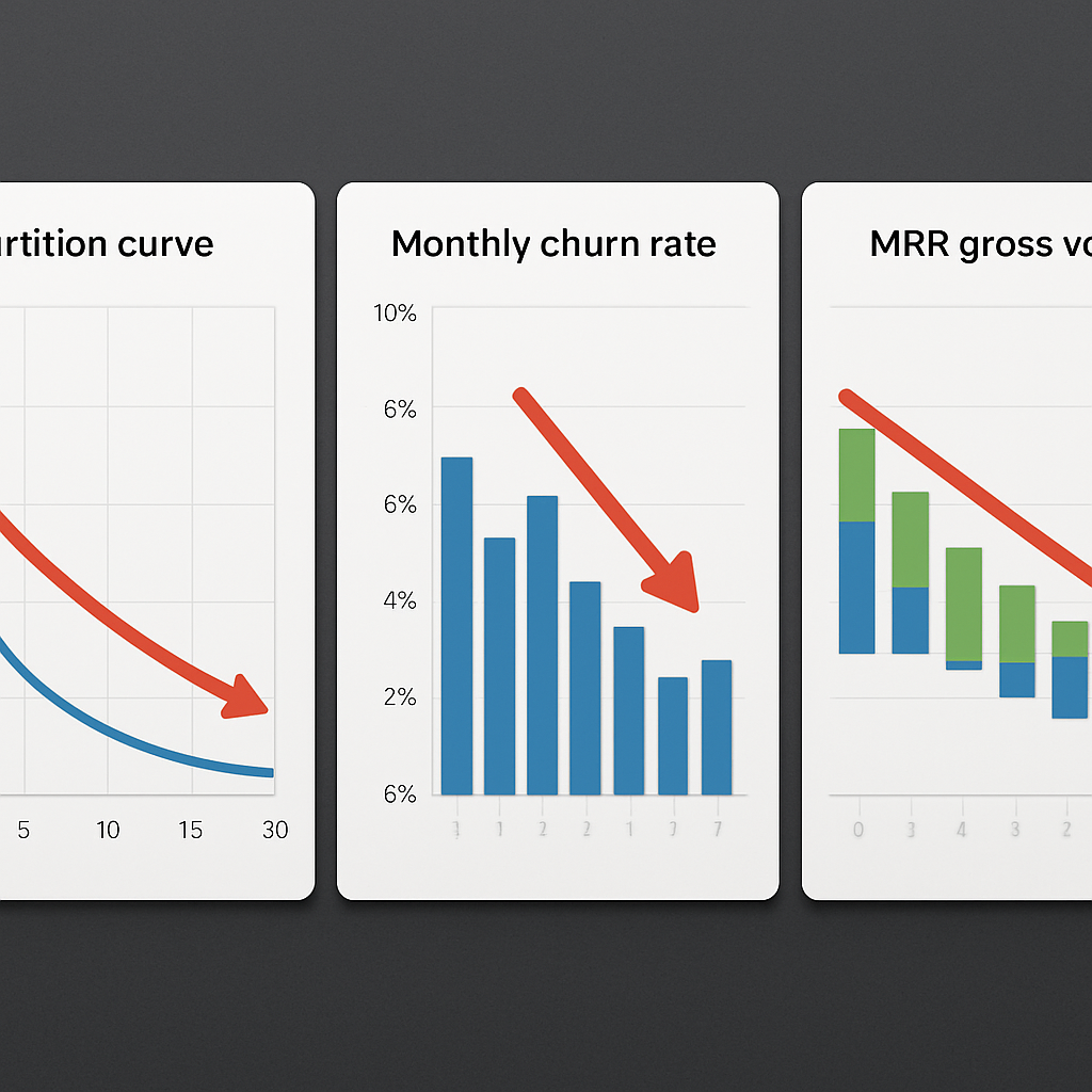
2. Customer Attrition Starts Earlier Than You Think – Here’s How to Spot It
Direct point: customer attrition almost always appears as a pattern of declining behaviors long before a cancellation event shows up in billing. That window is where you buy time to act – but only if your detection is framed around activity decay, not only around billing or open rates.
Operational signals to instrument immediately
You need three types of signals wired into one timeline: recency and frequency of core actions, value changes (basket size or paid sessions), and engagement friction (failed payments, missed appointments). Treat these as events in a single customer record and compute short rolling deltas rather than absolute thresholds. Rolling percent change is both simpler and more comparable across cohorts than raw counts.
- Recency shift: last qualifying visit moves from daily/weekly to >X days compared to the customer baseline – use cohort baselines rather than global averages.
- Value slip: average spend or session length drops 20 percent vs the first 30 days for that customer – this often precedes disengagement.
- Engagement friction: sequence of two failed charges or two no-shows within 45 days – high predictive weight and immediate workflow trigger.
Tradeoff to manage: shorter windows catch risk earlier but increase false positives and operational cost for outreach. If your ops team can only handle a small queue, calibrate for precision – prioritize multi-signal flags (for example, recency drop plus value slip) rather than single-signal triggers. If you overreact to noise you will burn incentives and exhaust staff effort without measurable retention gains.
Concrete example – real-world application
Concrete Example: A neighborhood wellness studio tracks class check-ins and sees that new trial customers who attend fewer than two classes in their first 14 days have a 4x higher chance of lapsing by month three. They implemented a 14-day reactivation flow combining an instructor match email and a one-time add-on credit; the targeted segment responded at three times the rate of a blanket newsletter. The team limited outreach to customers whose class frequency dropped and whose first-class NPS was below the cohort median to avoid wasting offers on healthy accounts.
Judgment: many teams rely too heavily on opens and clicks as early warning signals. Those metrics are useful but weak – they are noisy and easily gamed by subject line changes. Real retention improvements come from prioritizing behavioral events that require time and effort from the customer – visits, purchases, bookings – and using engagement metrics only as secondary confirmation.
Key tactic: Build a composite risk score that weights recency, value, and friction. For example, assign +3 for failed payments, +2 for a 40 percent drop in visits, +1 for two consecutive non-opens. Use a short pilot to choose the threshold that yields a manageable outreach queue. For tooling, tie event streams into your CDP and create automated workflows in your engagement platform, for instance see Gleantap product.
Small validation experiment you can run this week – split customers flagged by your composite score into treatment and control. Send a low-cost, behavior-focused intervention to the treatment group and measure reactivation over 30 days. This test tells you two things fast: whether your signal is predictive in your business context and whether your chosen intervention produces incremental value.
A final operational consideration: account for seasonality and onboarding effects in your definitions. New customers naturally settle into a usage pattern; label their early activity as baseline to avoid false attrition signals. If you calibrate with cohorts and re-run thresholds monthly, your attrition alerts will remain actionable rather than noisy.
For context on the value of keeping customers, remember that small improvements in retention scale profit disproportionately. See the classic analysis at The Value of Keeping the Right Customers for why early detection and targeted intervention are high-leverage activities.
3. Measurement Techniques: Cohort Analysis, Survival Curves, and Segmentation
Direct point: Good measurement separates where attrition begins from when churn happens. Use cohort curves to pinpoint the moment behavior decays, survival curves to quantify lifetime risk, and segmentation to prioritize intervention queues.
How to set up the analysis pipeline
Start with three clean inputs on a single customer timeline: an acquisition or cohort timestamp, a stream of qualifying engagement events, and billing/exit markers. Keep event definitions consistent across cohorts: a visit must mean the same thing for everyone, a purchase must include the same revenue fields, and a missed booking must be a named event in your source system.
- Step 1 – Build cohorts by acquisition week or first-paid date: group customers by their first qualifying event so you can compare identical-aged customers over time.
- Step 2 – Compute N-day retention per cohort: count customers who have at least one qualifying event in each N-day window (D7, D30, D60) and express as percent of cohort size.
- Step 3 – Produce Kaplan-Meier survival curves: treat a cancellation or permanent lapse as an event, censor active customers at analysis date, and report median survival and hazard spikes.
- Step 4 – Layer segmentation: slice cohorts by initial engagement level, revenue tier, or channel to reveal which groups drive early attrition versus late churn.
Practical trade-off: finer-grained cohorts (daily) show fast-moving problems but require larger samples and amplify noise. If your sample is small, use weekly cohorts and longer windows to avoid chasing statistical ghosts.
Pseudocode and analysis notes (use your SQL engine)
A compact approach: compute cohortid, then produce a grid of days-since-cohort with active flags. Example pseudocode: WITH base AS (SELECT customerid, MIN(firsteventdate) AS cohortdate FROM events GROUP BY customerid), activity AS (SELECT b.cohortdate, e.customerid, DATEDIFF(day, b.cohortdate, e.eventdate) AS days FROM base b JOIN events e USING (customerid)) SELECT cohortdate, days, COUNT(DISTINCT customerid) AS activecount FROM activity GROUP BY cohortdate, days ORDER BY cohort_date, days; Use that grid to build retention matrices and then derive survival by treating the first censoring event as churn.
Limitation to watch: survival models assume the event definition is final. If you rely on short inactivity thresholds to mark attrition, you will artificially shorten apparent survival. Keep churn events strictly tied to cancellations or long-term lapses and use separate attrition metrics for early warning.
| Cohort Window | What it reveals | Operational priority |
| D7-D30 retention | Early engagement decay and onboarding gaps | High – trigger onboarding nudges and instructor matches |
| D31-D90 retention | Sustained usage patterns and second-month drop-offs | Medium – targeted incentives and content flows |
| >D90 survival | Long-term loyalty and revenue risk | Low-to-medium – membership recovery and VIP outreach |
Concrete example: A mid-size fitness chain constructed weekly cohorts and found a consistent increase in drop-off between weeks 2 and 4 for customers acquired through a promotion channel. They prioritized that channel for a tailored onboarding sequence and re-measured cohort survival; the re-targeted cohorts showed a clear right-shift in median survival compared with historical cohorts.
Customer Attrition Starts Earlier Than You Think — Here’s How to Spot It is not just a slogan; the right visualization will show a knee in the retention curve before any cancellation spikes. Use that knee to design timeboxed plays.
Judgment: many teams stop at a single monthly churn number and miss the signal timing. Cohort retention matrices and Kaplan-Meier plots force you to see when attrition accelerates and which segments create downstream churn. Prioritize actions where a small percentage shift in early retention meaningfully reduces later churn – that is higher ROI than broad-based winbacks, a principle also relevant to Flow State Sales teams focused on customer retention and expansion.
Key takeaway: Build cohort matrices and survival curves from event-level data, then map segments to operational queues. If you need tooling, stream events into a CDP and automate the top-priority cohorts into your engagement platform, for example see Gleantap product and the economic case in Bain.

Next consideration: set a cadence for re-running cohorts and re-calibrating segments. Measurement without governance becomes stale; schedule a monthly review that ties cohort shifts to specific experiments so you convert analysis into reduced customer turnover.
Measurement is an operational tool, not a report. Use cohort timing and survival hazards to choose where to spend limited outreach capacity.
4. Leading Signals and Data Sources for Early Detection
Direct point: To catch attrition before it becomes churn, instrument signals that reflect real customer effort and tie them together into a single timeline. Passive metrics like opens matter less than actions that cost the customer time or money.
Which signals actually predict loss and how reliable each one is
- Transaction gaps: purchase or visit absence relative to the customer’s baseline – high predictive value because it shows stopped behavior
- Failed payments and billing declines: billing failure events – very high immediacy and should trigger recovery flows
- Booking and attendance drops: cancellations, no-shows, or reduced booking frequency – stronger than opens because they indicate friction
- Product or feature falloff: drop in core feature usage (class check-ins, prescription refills) – medium-to-high signal depending on feature importance
- Engagement signals with context: low email opens alone are weak; low opens plus falling visits form a stronger indicator
- Customer feedback changes: sharp NPS or CSAT declines – actionable for high-touch outreach but noisy at scale
Data sources to prioritize: POS and loyalty systems for spend and AOV trends, membership platforms such as Mindbody or Zen Planner for attendance and bookings, billing feeds from Stripe or Recurly for payment health, and engagement channels for confirmation or corroboration. Stream these into a timestamped event store so every signal can be compared against the same customer clock.
Practical scoring approach: combine signal strength and recency into a confidence-weighted score. For example, treat a recent failed payment as a near-certain trigger, while a 20 percent drop in app sessions is a medium-confidence signal that needs corroboration. Use simple Bayesian updating or multiplicative confidence to reduce false positives when you have limited outreach capacity.
Concrete example: A retail chain merged POS, app sessions, and marketing engagement into a single feed. Customers with no in-store transactions for 45 days, app sessions down 50 percent, and a single billing decline were placed into a high-priority outreach queue. The first 2-week pilot showed those customers were 3.2 times likelier to convert from a targeted 20 percent discount than customers only flagged by email inactivity.
Tradeoff to manage: maximize precision when operational capacity is tight – prefer multi-signal triggers – or maximize recall if you have automated low-cost touches. Over-alerting burns incentives and staff time; under-alerting loses early intervention benefit. Choose thresholds based on available outreach bandwidth and measure incremental lift with a randomized holdout.
Key takeaway: Customer Attrition Starts Earlier Than You Think — Here’s How to Spot It. Prioritize effort-based signals, centralize event timestamps, and use confidence-weighted scoring to turn noisy inputs into actionable queues. Start by wiring billing and attendance streams into your CDP and run a quick treatment/control pilot to validate signal precision. For implementation, see Gleantap product for an example of tying these streams into automated workflows.
5. Vertical Playbooks with Concrete Campaign Templates
Direct point: Build playbooks that map specific attrition signals to a single, measurable action path — not a generic drip. Each vertical has predictable behavioral failure modes; the playbook must match the failure mode, the cheapest effective channel, and a tight success metric you can test within 30 days.
Fitness clubs — convert early habits into routines
Play template: Trigger a 3-step sequence when a new member misses two scheduled sessions within their first two weeks. Step 1: a coach check-in SMS on day 3 with a recommended class link. Step 2: targeted class pass offer (single-use) via email on day 8. Step 3: a phone or SMS follow-up from a staff member on day 14 for members who did not rebook. KPI focus: activity reactivation within 10 days and 60-day membership survival. Trade-off: automated SMS scales cheaply; human touch converts better but should be reserved for the highest-probability flags.
Wellness studios — small nudges, big behavior change
Play template: For trial clients, run a two-week calibration series: a personalized schedule reminder the evening before the second class, an instructor-match note with social proof after the second class, then a targeted micro-incentive (20 percent off a month) if the client has not booked a third class by day 21. Consideration: avoid blanket discounts; use the incentive sparingly and only for customers flagged by behavior plus low onboarding NPS to preserve margin.
Retail — turn dormant buyers into active VIPs
Play template: Identify customers with purchase gaps greater than their personal cadence and a decline in AOV. Deliver a layered campaign: an algorithmic product reminder (email), then a limited-time VIP credit applied automatically at checkout for those who open the message, and finally an SMS reminder to nudge conversion. Practical insight: price incentives perform well for low-margin impulse buyers; for higher-ticket segments, prioritized concierge outreach yields better lifetime value preservation.
Family entertainment centers — event-driven reactivation
Play template: Use date triggers (birthdays, half-year anniversaries) plus absence signals to create family bundles: a curated event invitation sent 30 days before the birthday, a reminder with an exclusive add-on two weeks later, and a short-survey follow-up after attendance to capture satisfaction. Use case: a center that tied birthday campaigns to a family photo voucher saw a measurable bump in repeat bookings for the next 90 days while keeping discounting minimal.
Healthcare membership programs — compliance-aware touchpoints
Play template: For members who miss routine appointments or have gaps in follow-up care, trigger a secure outreach workflow: appointment reminder, educational content tailored to their care plan, and a clinician-initiated check-in when two or more appointments are missed. Constraint: maintain privacy and consent; map every message to legal requirements and document opt-ins. Personal clinical outreach converts better than generic incentives but is costlier and must be triaged by risk.
Concrete example: A three-club fitness operator implemented the fitness play template above. They routed medium-risk members to automated SMS flows and high-risk members to staff outreach. Within eight weeks the club reported a measurable increase in class attendance among the targeted group and a reduction in short-term membership lapses compared with a holdout. This validated the signal thresholds and allowed the team to scale the higher-touch interventions selectively.
Judgment: Playbooks work when they are specific and measurable. Generic newsletters or loyalty point blasts produce low incremental lift. The right mix is predictable: automated, behavior-driven nudges for scale; selective human outreach where ROI justifies the labor. Tie every play to one clear metric — reactivation within X days — and use a randomized holdout to measure true incremental impact.
Important: Customer Attrition Starts Earlier Than You Think — Here’s How to Spot It. Use behavioral triggers (missed sessions, booking gaps, payment friction) mapped to the single most efficient action for your vertical. For implementation, integrate event streams into your CDP and build the workflows in your engagement platform, for example Gleantap product.

Next consideration: Start small: pick one vertical, wire the key signals into a single timeline, run a 30-day pilot with a treatment/control, and commit to one operational decision — scale the human touch or double down on automation — based on measured incremental ROI.
6. Winback and Retention Experiments: Design, Metrics, and Expected ROI
Direct point: Design experiments the way you run product tests — narrow hypothesis, clean control, and a measurable business outcome. Winbacks are not marketing plays; they are quantifiable interventions that must show incremental reactivation and positive payback against campaign cost and operational load.
Experiment design checklist
- Define the hypothesis and primary metric: state precisely what you expect (for example, a personalized SMS will increase 30-day reactivation rate by X percentage points). Use incremental reactivation rate as the primary outcome, not gross conversions.
- Pick a clean target cohort: choose a single attrition definition (e.g., 45 days inactive + at least one prior 3-month purchase) and hold out a randomized control that receives no intervention for the test window.
- Specify treatment and exposure rules: channels, creative, frequency, and whether staff outreach is part of the treatment. Lock these details before the test to avoid post-hoc rationalization.
- Estimate required sample size: run a minimal power calculation for your expected uplift. Small pilots are fine for signal validation; scale only after statistically meaningful lift is observed.
- Set timeboxes and guardrails: define lookback windows, measurement windows (14/30/90 days), and maximum campaign cost per customer to preserve margin.
- Plan attribution and leakage controls: prevent overlapping campaigns and use deterministic identifiers so reactivations tie back to the right treatment.
Practical trade-off: If you have limited volume, prioritize precision over breadth. A narrow, high-confidence cohort tested with a modest sample will tell you whether the play is worth scaling; a broad test that mixes signals will produce noisy results and wasted incentives.
Three high-yield experiment templates
- Discount-based winback: timed discount delivered by SMS with an expiry of 7 days. Best when reactivation friction is price-sensitive and you can restrict discounts to low-LTV segments.
- Value-add nurture: send curated content or credits (class credits, product samples) over 14 days. Works where education or service-match is the barrier rather than price.
- Human outreach: staff call or personalized message for high-LTV customers. Expensive, so reserve for segments where expected LTV recovery justifies labor.
Concrete example: A regional fitness operator ran a seed experiment on 1,200 dormant members (inactive 60+ days). They randomized 600 to receive a two-step treatment: an SMS with an instructor match link, then a waived guest pass if they booked within 10 days. After 30 days the treatment group had a 15 percent reactivation rate versus 6 percent in control. The team used that lift to justify a scaled automation where high-propensity flags receive the same sequence and the highest-value customers also get a staff follow-up.
Metrics to track (beyond a headline reactivation): incremental reactivation rate, incremental revenue per contacted customer, cost per reactivation (media + incentives + labor), payback period (days until campaign revenue covers cost), and retention of reactivated customers at D90. Track both count-based and revenue-based outcomes so you do not optimize for cheap small purchases that depress LTV.
| Metric | Example value | How to compute / use |
| Incremental reactivation rate | 9% | Treatment conversion minus control conversion over 30 days |
| Revenue per reactivated customer | $72 | Sum of purchases in 30 days post-reactivation / number reactivated |
| Cost per reactivation | $9 | Total campaign cost divided by number reactivated |
| Payback period | 11 days | Campaign cost per reactivation divided by average daily gross margin from reactivated customers |
Statistical and operational limitations: Small uplifts require large samples. Beware of seasonality and channel saturation: running multiple retention plays simultaneously will contaminate attribution. If you cannot isolate impact, prefer sequential rollouts or geographic holdouts. Also, human outreach scales poorly — use it as a precision tool, not a first-line tactic.
Judgment: In practice, the highest ROI experiments are those that combine a low-cost automated touch with a narrowly targeted incentive. Heavy discounts win short-term reconversions but erode long-term margin unless you restrict them to clearly price-sensitive cohorts. Conversely, content-first plays preserve margin but need stronger segmentation to show measurable lift.
Customer Attrition Starts Earlier Than You Think — Here’s How to Spot It
Key takeaway: Run a small, randomized pilot first to validate your attrition signals and the chosen intervention. Use the results to estimate expected ROI and scale only when payback and D90 retention meet your margin rules. For operational automation and closed-loop measurement, integrate event streams into your CDP and tie workflows to outcomes; see Gleantap product for an implementation pattern.
7. Using AI and Gleantap to Operationalize Early Detection and Automated Remediation
Direct point: Use predictive scoring as a triage engine, not an oracle. The practical value of AI here is prioritization: it tells you which customers are worth doing something about and what action is most likely to move the needle.
AI models score customer attrition risk by combining recency, frequency, monetary signals, payment health, and channel engagement into a single probability (for example, probability of defection within 30 days). Pair that probability with a short attribution breakdown so operators know why a customer is flagged (failed payment, visit drop, booking falloff). That makes automated remediation both timely and explainable.
How to wire AI and Gleantap into an operational loop
Start with three concrete integration layers: event ingestion, model scoring, and workflow orchestration. Ingest attendance, POS, booking, and billing events into your CDP; run feature pipelines that yield last_activity, visit cadence, AOV trend, and payment-failure counts; produce a risk score and feature attributions; then map that output into Gleantap workflows that trigger channel actions and staff tasks.
- Model outputs: probability of attrition at 30/60/90 days plus top 3 contributing signals.
- Rules engine: combine score bands with business rules (capacity, segment LTV, privacy constraints) before actioning.
- Orchestration: multi-step flows in Gleantap (SMS → email → staff task) with conditional branches and cooldowns to avoid oversaturation.
Practical trade-off: aggressive thresholds increase reach but drive more false positives and operational cost. Calibrate toward precision if your outreach is human-led; calibrate toward recall if you have low-cost automated touches. Either way, enforce a maximum daily queue size and measure incremental lift with holdouts.
Customer Attrition Starts Earlier Than You Think — Here’s How to Spot It must be operationalized into a retrainable loop. Capture outcomes (did the customer reactivate, cancel, or stay silent) and feed those labels back into the model every 30–90 days so the system adapts to seasonality, new campaigns, or price changes.
Concrete example: A regional wellness chain connected Mindbody and Stripe into Gleantap, trained a model on historic attendance and billing signals, and flagged 450 high-risk customers for a 3-step automated flow. The orchestration routed high-confidence flags to an SMS + booking link and reserved human follow-up for the top-tier LTV segment; within a month the team observed a measurable uplift in short-term reactivations versus a randomized holdout.
Be explicit about limits and governance. AI degrades when upstream events change (a new class type, a pricing change, or a marketing push). Document feature definitions, lock the model-serving contract, set an SLA for manual review of edge cases, and require product owners to revalidate thresholds after major business changes.
Operational imperative: enforce closed-loop measurement. Log every automated send and staff contact back to the CDP, track incremental reactivation against a control, and retrain the model on labeled outcomes. For implementation details and workflow templates, see Gleantap product.
Judgment: AI in attrition work succeeds when it reduces decision latency and focuses scarce human effort. If you use it only to generate reports, you will not change customer turnover. Use predictive scores to move customers into the right remediation path, then treat model outputs as a prioritization signal that is always checked against capacity and margin rules.
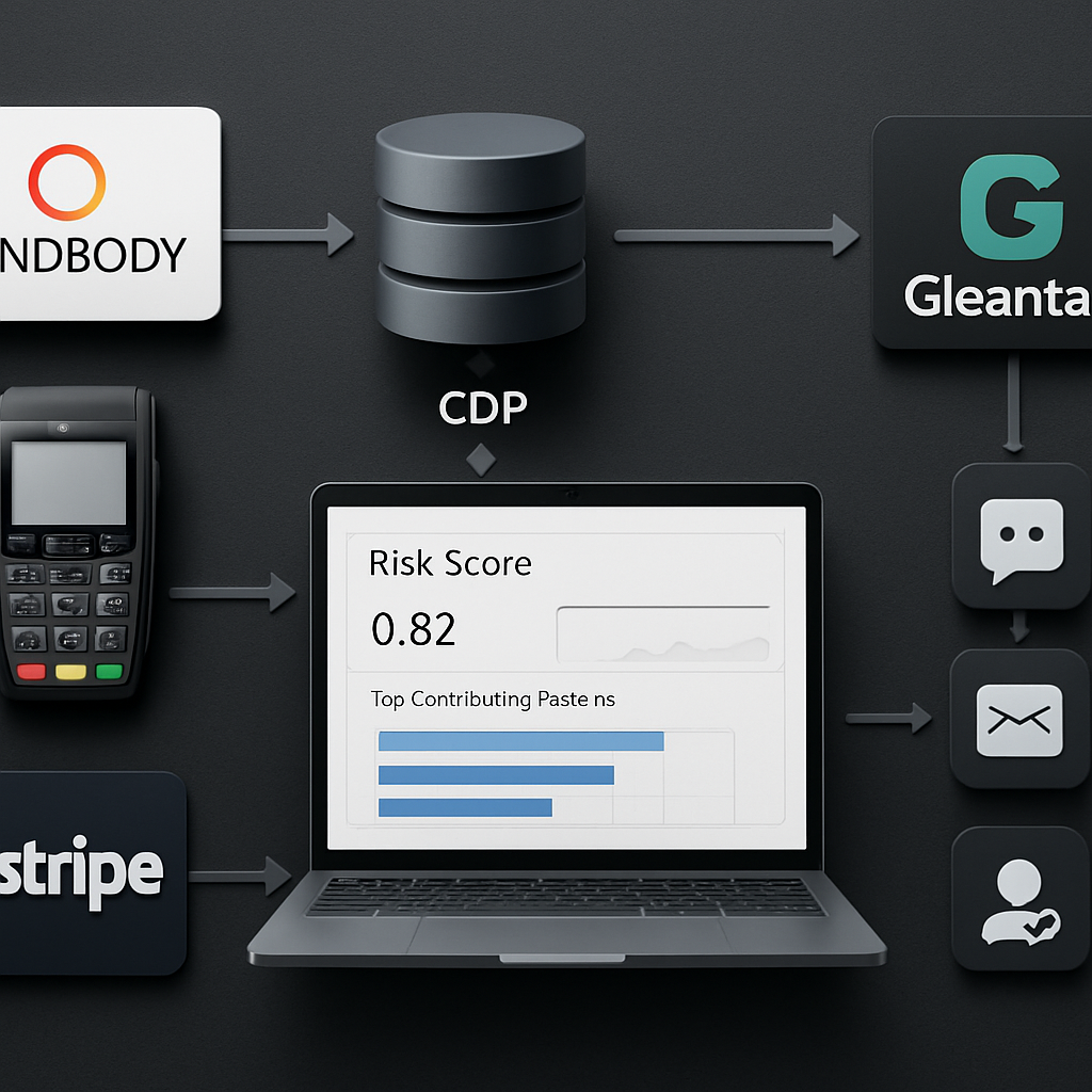
Next consideration: pick one high-value use case, run a short randomized pilot, validate incremental LTV impact, and only then scale the automated remediation. Treat the pilot as a systems integration test as much as a modeling exercise—broken data or uncalibrated thresholds will erode trust faster than a noisy model.
8. Measurement Dashboard and 30/60/90 Day Implementation Checklist
Direct point: Build a lean operations dashboard that forces decisions, not vanity metrics. The purpose is simple: convert early customer attrition signals into prioritized actions with owners, SLAs, and a closed-loop outcome trace so teams can see which plays actually reduce customer loss.
What the dashboard must do
A good dashboard is an operational control panel, not a historical report. It answers three questions at a glance: Which cohorts are decaying fastest, which customers are worth outreach, and which campaigns are producing net retention. If your panels do not tie directly to a specific action or owner, remove them.
| Panel | Why it matters | Action tied to panel | Owner | Update cadence |
| N-day Attrition Curve (chosen N per vertical) | Shows where behavioral decay begins inside the lifecycle | Create or pause onboarding nudges; escalate high-risk segment | Retention analyst | Daily |
| Cohort Survival Heatmap (week-of-acquisition) | Reveals knees and channel-specific onboarding failures | Prioritize acquisition channels for onboarding experiments | Growth lead | Weekly |
| Attrition Risk Distribution (score bands) | Triage queue sizing and staffing needs | Allocate human follow-up or automated flows based on capacity | Ops manager | Daily |
| Winback Conversion & Payback | Measures true incremental ROI of campaigns | Stop low-performing plays and scale winning ones | Campaign owner | Weekly |
30/60/90 day implementation checklist (practical steps)
- Day 0–30 — Foundation: Instrument event streams (attendances, purchases, bookings, billing events) into a single customer timeline; define one operational N for attrition per vertical and compute baseline cohort matrices. Assign a single owner for daily alert triage and set a maximum outreach queue size.
- Day 31–60 — Triage and tests: Build a simple risk score and run two randomized pilots (one automated touch, one human-assisted) against a holdout. Create workflows that map score bands to actions and log outcomes back into the CDP for measurement.
- Day 61–90 — Iterate and scale: Freeze successful sequences, reassign saved manual effort to higher-value flags, retrain score thresholds based on labeled outcomes, and embed retention KPIs into a weekly ops review with SLAs for contact and follow-up.
Practical trade-off: You will face a trade between recall and operational cost. If outreach is mostly automated, cast a wider net and accept more false positives. If human follow-up is primary, tune for precision and combine signals before flagging. Either approach must cap daily throughput to avoid burnout and incentive waste.
Concrete example: A three-location fitness operator implemented this exact sequence: they streamed check-ins and Stripe billing to a CDP, set a 21-day attrition N for new members, and ran a 45-day pilot. Automated SMS flows targeted medium-risk members while the highest-LTV flags received a concierge call. Within two months the team reduced short-term lapses and could demonstrate payback on staff time, which justified scaling the human touch selectively.
Customer Attrition Starts Earlier Than You Think — Here’s How to Spot It. This dashboard-and-checklist approach makes that principle operational: visualize the knee in early activity, turn it into a prioritized queue, and measure whether your interventions actually shift cohort survival.
Governance and measurement judgment: Don’t treat the score as an order — treat it as a prioritization signal that must pass business-rule gates (capacity, LTV cutoff, consent). Enforce a monthly retrain cadence and a post-campaign review that reconciles predicted risk vs observed outcomes; models and thresholds decay when product, pricing, or marketing changes.
Sample targets for first 90 days: aim for a measurable lift such as a 3–7 percentage-point improvement in D30 retention for the targeted cohorts, reduce high-risk queue aging to under 48 hours, and achieve positive payback on human outreach within 60 days for prioritized segments. Use Gleantap or your CDP to automate the event routing and closed-loop measurement.
If the dashboard is not tied to a one-sentence action and an owner, it is a report — remove it and free room for the metrics that actually reduce customer loss.
Frequently Asked Questions
Quick orientation: This FAQ focuses on operational clarity — where to look for early warning signs, which metrics drive decisions, and practical trade-offs teams face when converting attrition signals into action. Customer Attrition Starts Earlier Than You Think — Here’s How to Spot It should inform every answer below: treat attrition as an upstream signal, churn as the downstream event you want to avoid.
How is customer attrition different from customer churn in practice?
Answer: Attrition is a sequence of weakening behaviors on a customer timeline — fewer visits, falling spend, missed bookings — while churn is the final administrative exit. In practice, attrition is actionable because it gives you a window to intervene; churn is what you measure to prove whether those interventions worked.
Which metric should I prioritize: attrition rate or churn rate?
Answer: Operate both but use them differently: attrition metrics for triage and intervention queues, churn metrics for financial and executive reporting. If you must choose what to optimize first, codify a reliable N-day attrition that maps to a realistic outreach SLA — that produces the fastest operational lift.
What are the fastest ways to spot attrition in a fitness club?
Answer: Prioritize effortful behaviors: attendance cadence, class bookings kept vs canceled, and billing health. Practical trade-off: short windows catch decay sooner but will create more work; calibrate to your capacity. Concrete example: A mid-size gym discovered new members who dropped from weekly to monthly check-ins within two weeks were much likelier to lapse. They added an automated coach SMS on day 8 and reserved personal calls only for the highest-value members; the targeted approach raised short-term rebooking without bloating staff queues.
Can predictive models reliably identify customers likely to churn?
Answer: Predictive scores work as prioritization tools, not guarantees. Their value comes from improving precision so scarce human outreach lands on customers with the biggest upside. Limitations: models degrade when upstream definitions shift (new product, pricing change) and they need closed-loop labels to stay calibrated.
How do I measure whether a winback campaign is effective?
Answer: Use randomized control so you measure incremental reactivation, not gross conversions. Track short-term reactivation, incremental revenue, cost per reactivation, and retention of reactivated customers at an appropriate horizon (e.g., 60–90 days). Avoid optimizing for cheap, low-LTV purchases — pair count with revenue outcomes.
Should I use revenue-based churn metrics or customer-count churn metrics?
Answer: Both. Customer-count metrics show penetration and behavioral health; revenue-based metrics reveal dollar impact and prioritize high-value recoveries. Operationally, use count-based attrition for broad triage and revenue-weighted rules to decide when to escalate human outreach.
What integrations are essential to detect attrition early?
Answer: The minimum set ties activity, billing, and engagement together: attendance or transaction events, billing and payment status, and channel engagement (email/SMS delivery and response). Without a joined timeline you will mis-prioritize outreach and burn incentives on false positives.
Operational rule: Build a single customer timeline, cap your daily outreach, and enforce multi-signal confirmation before escalating to human touch. For implementation patterns and workflow templates see Gleantap product.
Common misunderstanding: Teams often treat opens and clicks as the primary early-warning signals. In real-world retention work, low-effort engagement signals are noisy; prioritize signals that require customer time or money and use opens only as secondary confirmation. That reduces false positives and preserves incentives for customers who matter.
Next actions you can implement this week: 1) Pick an N-day that fits your vertical and compute baseline attrition cohorts; 2) Run a small randomized pilot that targets a composite risk segment (recency + payment or value slip) with one automated touch and a holdout; 3) Route outcomes back into your CDP and set an owner with a 48-hour SLA for the high-priority queue. These three steps turn the principle Customer Attrition Starts Earlier Than You Think — Here’s How to Spot It into operational momentum.
Gleantap’s health scores and automated win-back journeys re-engage customers the moment they show churn signals.
See how Gleantap reduces churn →


Ready to Run Successful Marketing Campaigns and Grow Your Business?
Gleantap helps you unify customer data, track behavior patterns, and automate personalized campaigns, so you can increase repeat purchases and grow your business.
Ready to Run Successful Marketing Campaigns and Grow Your Business?
Gleantap helps you unify customer data, track behavior patterns, and automate personalized campaigns, so you can increase repeat purchases and grow your business.