
 Divya Ghughatyal
Landing page optimization is the fastest way to turn traffic into real leads, but most teams waste time on cosmetic tweaks that do not move the needle. This short, step by step guide focuses on high-impact changes you can measure immediately — headlines, CTA placement, form friction, mobile speed, A B testing, and trust signals — with experiment templates and the metrics to prove lift. You will also get practical post-conversion workflows to stop leads from slipping away, including examples you can plug into Gleantap for immediate follow up.
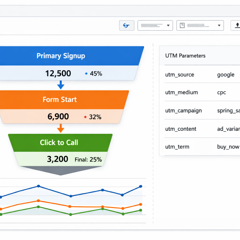
1. Define conversion goals, key metrics, and attribution
Start with a single measurable outcome. Define one primary conversion that maps directly to business value – trial signup, appointment booked, or paid membership – and treat everything else as a secondary conversion used for diagnosis or nurturing.
Primary versus secondary conversions. Primary conversions drive revenue or a clear downstream event. Secondary conversions are intermediate signals – phone calls, downloads, video plays – that matter for funnel diagnosis or personalization in Gleantap workflows but should not replace the primary KPI for tests.
Conversion measurement template
| Metric name | Event definition | Tool to track | Baseline | Target |
| Primary signup | Completed trial form submission | Google Analytics + Gleantap event | 3.2% conversion rate | 4.0% (20 percent relative lift) |
| Phone lead | Clicked click to call | Google Analytics event | 120 calls / month | 132 calls (10 percent lift) |
| Form abandonment | Started form but did not submit | Hotjar + GA funnel | 45 percent abandonment | 35 percent abandonment |
Attribution and naming conventions matter more than you think. Use consistent UTM conventions and event names so Gleantap can consume lead attributes for personalized follow up. For example use utmmedium=paidsearch, utmcampaign=summertrial2026 and event name trialsubmission to avoid mapping errors during automation.
- 6 step checklist to map landing page goals to analytics and Gleantap triggers: Define primary conversion and secondary signals
- Instrument the conversion event in Google Analytics and send the same event to Gleantap as an inbound lead trigger
- Standardize UTM naming – medium, source, campaign – and document it in a shared sheet
- Record baselines for each metric over 2 to 4 weeks before changes
- Set realistic targets – 10 to 30 percent relative improvement depending on traffic and effort
- Define attribution rules up front – last click for quick wins, multi touch for marketing credit
Practical tradeoff. If traffic is low, prioritize reliable event tracking and Gleantap integration over aggressive split testing. Running many tests with small samples produces false positives and wastes resources. Better to get clean attribution and then run one meaningful experiment at a time.
Concrete example: A boutique gym sets primary conversion to trial signup and secondary conversion to phone call. They implement a single GA event trial_submission, map it to a Gleantap lead trigger, and tag each lead with utmcampaign and landing_page_version. After two weeks they see a 15 percent uptick in trial signups from paid search and trigger an automated SMS confirming the trial using Gleantap, which increases show rate.
Key takeaway: Measure what moves revenue – pick one primary conversion, instrument it consistently across analytics and Gleantap, and fix attribution before you run A B tests.
2. Craft a single, crystal clear above the fold value proposition
Start with one decision. The above the fold area must answer in three seconds what you offer, who it is for, and the next action. If visitors are still guessing after that window you lose the testable lift you need for landing page optimization.
Headline formula and microcopy that work
Headline formula: main benefit + quantifier + target audience.** Use a supporting subheadline that removes the biggest objection in one short clause. Keep both lines readable on mobile without shrinking type below 18px.
- Formula example: Get stronger faster – 30 day trial for busy professionals
- Gym headline variants to A/B test: Try: Get Stronger in 30 Days – Free Week for New Members; Try: 30 Day Free Trial – Small Group Coaching for Busy Adults; Try: Try Three Classes Free – No Commitment, First Visit This Week
- CTA templates: Start Free Trial, Book Your Free Week, Reserve My Spot
Subheadline rule: address the largest perceived risk.** If price is the worry, say Trial free – cancel anytime. If schedule is the worry, say Flexible evening classes. This short line often moves more people than small layout or color tweaks.
Hero media and trade-offs
Choose media for clarity and speed. A single, well-shot photo communicates trust and loads fast. Short looped video can show the experience but costs you load time and mobile data. If you use video, provide a compressed mobile fallback and test the performance impact with PageSpeed Insights.
- Placement rules: primary CTA visible in the first viewport; include one sticky CTA as a backup
- Visual discipline: remove site navigation that competes with the offer or turn it into a compact menu icon
- Contrast and whitespace: give the CTA breathing room – aim for 40 to 60 pixels of clear space on desktop and 20 to 30 on mobile
Practical limitation: clarity sometimes reduces perceived sophistication.** A barebones headline and big CTA will typically raise conversions but may lower perceived premium value for high-end services. If your business needs to signal luxury, split test minimal clarity against a version that includes trust signals and premium visuals.
Key takeaway: Simplify above the fold to one promise and one CTA. That single focus is the fastest lever in landing page optimization for most low-traffic and local-intent pages.
Concrete example: A neighborhood boutique gym replaced a multi-offer hero with a single headline – 30 Day Free Trial for New Members – and a single CTA – Reserve My Spot. They kept a small subheadline addressing schedule flexibility and added a compressed looping hero showing a class. Within two weeks they saw a measurable increase in trial signups with no change to traffic source. Use Gleantap to capture that lead and trigger an immediate SMS confirmation and first-visit reminder to protect the lift.
Experiment to run this week: A/B test current hero versus a single-proposition hero (benefit + quantifier + target). Track primary conversion rate and mobile vs desktop lift. If monthly visitors are under 3,000, run for four weeks or until you reach a sample that gives 80 percent power for a 10 percent lift.
3. Design the page to guide attention using visual hierarchy and patterns
Key point: Visual hierarchy is the practical control you have over what a visitor notices first, next, and last. If the visual flow is fuzzy, visitors will choose for you — and they rarely choose the CTA.
Use proven scanning patterns — but don’t treat them as templates
Pattern basics: Use the Z pattern for simple promotional pages and the F pattern for content-heavy pages; both are validated by Nielsen Norman Group. These patterns are about attention, not aesthetics. Arrange elements so the value proposition, supporting proof, and CTA fall along the natural scan path.
- Z pattern: Best when you want to move users from headline to CTA with minimal distraction.
- F pattern: Use when you need to show a list of benefits or features above the fold.
- Progressive disclosure: Hide secondary choices behind micro-interactions so the initial path stays single-minded.
Concrete layout rules you can hand off to a designer
- Single-column primary path: On mobile and desktop, avoid side-by-side CTAs that force a choice; create one visual lane to the action.
- Contrast and whitespace: Make the CTA the highest-contrast object and surround it with generous whitespace — treat the area around the button as sacred.
- Limit typography: Two typefaces, three sizes. Use size and weight to create hierarchy, not color alone.
- Button sizing: Aim for at least 44px tappable height on mobile and a visually dominant width on desktop so the CTA reads as the destination.
- Visual anchors: Use directional cues—arrow, gaze, or an overlapping image—to nudge the eye toward the action without cluttering the fold.
Practical trade-off: Big hero images and complex layouts increase persuasion but raise page load time and cognitive cost. Prioritize a lean layout for low-traffic paid landing pages where rapid conversions matter; reserve heavier visuals for high-value funnels where brand trust justifies the load time.
Validate attention quickly
Quick validation test: Run a heatmap and session recording for three days after a layout change. Look for two signals: click density around the CTA and time to first interaction. If clicks scatter, your hierarchy failed — simplify and retest. Use heatmaps alongside analytics to avoid misreading vertical scroll as engagement. Tools like Hotjar or Crazy Egg pair well with metrics from Google Analytics and the A/B testing ideas in Unbounce.
Concrete Example: A boutique gym replaced a busy hero slideshow with a single high-contrast CTA section and a small testimonial block aligned to the F-scan. Heatmaps showed CTA focus increasing; session recordings revealed fewer distractions above the fold. The team then used Gleantap customer profiles to tag leads by landing page variant for follow-up messaging.
Do this now: When briefing a designer, include a one-line visual hierarchy brief: primary goal, primary CTA, three elements that must appear above the fold, and a performance constraint like 3s mobile interactive load. Link results back to your analytics and to Gleantap so post-conversion flows can be measured against the variant.

Next consideration: Run a single visual hierarchy change as an A/B test and tie the variant to downstream metrics — not just clicks but lead quality and show rate using your Gleantap workflows — to avoid optimizing for shallow engagement.
4. Reduce form friction and optimize CTA flows
Start with the conversion you actually need, not every piece of data you might want. Long forms kill completion; short forms shift work into follow up. Your job is to pick the moment to ask for more information and design the CTA flow so that the visitor takes the primary action first.
Practical rules for forms and CTAs
- Single objective per form: Keep one clear goal – capture a lead, schedule a visit, or start a trial. Do not combine signups with surveys or upsells.
- Start minimal, profile later: Use progressive profiling or post-conversion flows to collect details. Ask only what is required to complete the immediate action.
- Mobile-first fields: Use phone-friendly input types, large tappable buttons, and place phone or CTA above the fold on small screens.
- Inline validation and helpful microcopy: Validate as users type and show friendly error messages. Tell users why you need a field when it looks intrusive.
- CTA flow control: Use one dominant CTA, one secondary low-contrast option (learn more), and avoid competing CTAs that split attention.
Tradeoff to manage: Reducing fields raises volume but can reduce lead quality. If quality matters more than volume, add lightweight friction – e.g., require a phone or add a short scheduling step – and then use Gleantap to qualify asynchronously with SMS or email.
Concrete example – fitness studio trial flow
Concrete Example: A boutique gym replaced a five-field form (name, email, phone, ZIP, fitness goal) with a two-field form (name, phone) and a sticky CTA that opens a one-step calendar picker. They used Gleantap to send an immediate SMS confirming the trial and a 24-hour pre-visit reminder with a short qualification question. Submissions increased 38 percent and first-visit show rate stayed stable because the follow up qualified leads before booking.
Judgment: If you run local appointment businesses, prioritize phone-first capture + immediate SMS. Email-only capture underperforms for same-week bookings.
Form variants and microcopy templates to test
- Variant A – Minimal lead: Fields: Name, Phone. Submit button: Book my trial – no card required. Privacy note: We will only text about this booking. Reply STOP to unsubscribe.
- Variant B – Short qualify: Fields: Name, Phone, Preferred Day. Submit button: Find available times. Microcopy for day field: Picking a day speeds booking but you can change it later.
- Variant C – Multi-step: Step 1: Name, Email. Step 2: Calendar picker and phone. Submit button: Reserve spot. Microcopy between steps: It takes 30 seconds – we only need a phone to confirm.
Note on privacy and compliance: Always show a concise privacy note near the submit button and use explicit consent for automated SMS. Small businesses often skip consent and get deliverability or legal problems.
One-week experiment template
- Hypothesis: Reducing fields from five to two will improve completed submissions by at least 20% while maintaining first-visit show rate within 10% of baseline.
- Metric to track: Conversion rate, lead-to-show rate, and lead quality (percentage qualified after Gleantap follow up).
- Sample size guidance: If baseline conversions are under 200 per week, run sequential tests or lengthen duration – small samples lead to false positives. Use a sample size calculator to set target visitors.
- Implementation: A/B test the short form against control, enable inline validation, and wire Gleantap to send an immediate qualification SMS for both variants.
Key metric: Track both raw conversion lift and the business outcome – lead-to-first-visit. A 30% increase in leads that yields a 5% drop in show rate can still be worse for revenue. Use Gleantap to measure show-rate lift directly.
Practical pitfall: Relying only on form completions creates blind spots. Always tie tests back to the next real step in your funnel – booking, visit, or paid conversion – and instrument that event in analytics and Gleantap so you measure real impact.
Next consideration: If short forms increase low-quality leads, switch to progressive profiling and qualification flows using Gleantap rather than reintroducing long forms on the landing page.
5. Add social proof and trust signals where they matter
Key point: Social proof must reduce perceived risk in the instant decision window around the CTA. Visitors evaluate trust in the two seconds before they commit; if you bury proof or use weak signals you will not move the needle on conversion rate optimization.
High impact trust elements
- Quantified outcomes: short metrics like 85 percent trial show rate or average first month retention increase credibility
- Local credibility badges: industry association, Chamber of Commerce, or local press logos that your audience recognizes
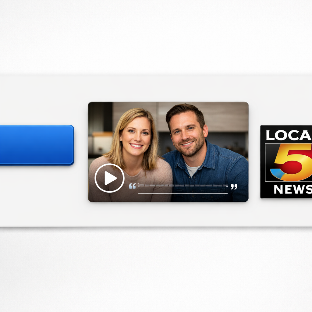
- Short video or photo testimonials: 10 to 20 second clips placed next to the CTA outperform long written quotes on mobile
- Customer logos or small brand grid: use for B2B or partner recognition but limit to five to avoid logo fatigue
- Security and payment icons: visible on checkout or paid sign up flows; they matter for paid conversions even on low dollar offers
Tradeoff to consider: More is not always better. Cluttering the hero with ten logos, three badges, and a long quote creates cognitive noise and can reduce perceived authenticity. Prioritize one strong, verifiable proof point near the CTA and move secondary proofs lower in the page for users who need more reassurance.
Placement rules and mobile considerations
- Next to the primary CTA: attach a one line stat or microtestimonial directly beside or below the button so the reassurance is available at the decision moment
- Post-submit confirmation area: reiterate trust with social proof and next steps to reduce buyer remorse and improve show rates
- Mobile-first brevity: use a single short testimonial with a thumbnail photo and one metric; reserve long testimonials for the desktop variant
- Progressive disclosure: show minimal proof above the fold and reveal more proof as the user scrolls or when they hover over trust badges
Practical limitation: If traffic volume is low, split testing many trust variants is usually underpowered. Test the presence versus absence of a single, strong proof element first. If you have enough traffic, test types – metric versus customer photo versus logo grid – and measure both conversion rate and lead quality.
Concrete example: A neighborhood gym added a 12 second video testimonial and a local press badge directly beside the sign up CTA. Over a two week split test the variant with the video raised trial signups by 18 percent and increased first visit rate when combined with an automated SMS reminder using Gleantap.
Quick evidence: Placing explicit trust signals near CTAs consistently improves conversions across tests. See Unbounce landing page best practices for practical examples and benchmark ideas.
Experiment to run this week: Add one short, verifiable proof element next to your CTA – a one line metric or a 10 second customer clip – and A B test it against the current page. Track primary conversions, first visit rate if you can, and lead quality for two weeks. If the lift is ambiguous, check session recordings to confirm viewers actually saw the element before concluding.
6. Optimize mobile performance and page speed
Immediate point: slow mobile pages kill conversion before your copy or CTA can influence the visitor. Core Web Vitals are not optional for landing page optimization; prioritize Largest Contentful Paint, First Input Delay, and Cumulative Layout Shift because these metrics predict whether a mobile visitor stays long enough to convert.
Quick 8-step mobile speed checklist
- Compress images to WebP and responsive sizes: export multiple widths, implement srcset, and use loading=lazy for images below the fold.
- Lazy load and defer nonessential assets: defer noncritical JS, lazy load widgets, and load analytics after interaction where possible.
- Audit and remove unused third-party scripts: chat widgets, tag managers, and A B testing snippets often add 300 to 800 ms each on mobile.
- Inline critical CSS and defer the rest: ensure above the fold styles render immediately so LCP improves without a full stylesheet download.
- Use a CDN and set aggressive caching: serve static assets from edge locations and add long cache TTLs with cache-busting on deploy.
- Limit web fonts and use font-display:swap: replace large font families with system stacks where brand tradeoffs permit.
- Trim JavaScript and use code-splitting: replace heavy libraries with smaller alternatives and only load code needed for the initial interaction.
- Preconnect and prefetch critical origins: add preconnect for analytics, API, and asset domains to shave DNS and TLS time.
Tradeoff to accept: some desirable features slow pages — personalization scripts, live chat, and full-featured booking widgets. You must decide which features drive measurable lift versus which ones cost conversions through speed. If a feature improves lead quality but adds 1 second of load time, test it behind a gated step or on the confirmation page rather than on the initial landing path.
Concrete Example: a local fitness studio replaced a full-width PNG hero with a compressed webp responsive image, deferred a third-party chat widget, and inlined critical CSS for the hero area. The page LCP dropped from ~4.8s to ~2.1s on midrange phones and the studio saw a noticeable reduction in bounce rate and a roughly consistent uplift in trial signups during the following four weeks.
How to test and verify: run Google PageSpeed Insights for lab and field data, use Lighthouse in Chrome DevTools with 3G throttling for repeatable runs, and validate real-user performance with Google Analytics RUM or session tools like Hotjar. Always test on a real midrange device as lab tools can be optimistic.
Avoid the false comfort of a fast desktop score. Mobile network variability and CPU constraints mean a desktop-friendly page can still perform poorly for your audience on phones.
Target metrics: aim for LCP under 2.5s, FID under 100ms or Interaction to Next Paint under 200ms, and CLS under 0.1.
Next consideration: once mobile load is under control, pair those gains with immediate post-conversion flows so the traffic uplift converts into visits — use Gleantap workflows to capture the improved mobile volume and reduce dropoff during booking and onboarding.
7. Plan A B tests and personalization that produce reliable lift
Start with a test plan, not a laundry list of ideas. A short, disciplined planning framework prevents wasted traffic and noisy results: hypothesis, variant, sample size estimate, traffic allocation, primary metric, and minimum test duration.
Test planning template
- Hypothesis: State the expected user behavior and why the change will move the metric
- Variant: Precisely what will change on the page – copy, image, form, or flow
- Primary metric: Conversion rate, leads per visitor, or show rate depending on goal
- Secondary metrics: Lead quality signals like phone calls, booking rate, or MQLs
- Sample size & duration: Use a calculator or the practical rules below; predefine minimum detectable effect
- Traffic allocation & segmentation: Decide equal split or weighted, and restrict by source if needed
- Success criteria: Numeric threshold and required runtime before declaring a winner
Practical rule for small businesses. If monthly landing traffic is under 5,000 visitors, run one meaningful test at a time and design for large, directional changes – headline, offer, or form length. Small visual tweaks rarely reach significance in low volume and waste precious weeks.
High impact tests to prioritize
- Headline/value prop variant for traffic from different channels
- CTA copy and placement – test text that reduces perceived friction versus urgency
- Form length – short form versus progressive profile flow
- Hero asset – static image versus short video or customer snapshot
- Personalized headline by UTM source or ad keyword using dynamic text replacement
Segmentation and personalization constraints. Personalization lifts conversions when targeted to clear segments – paid search, returning visitors, or regional traffic. Resist broad personalization on low volume segments: creating many micro-variants fragments data and prevents decisive results.
Concrete example: A neighborhood fitness studio ran an A B test on Facebook traffic: Variant A kept the generic headline; Variant B replaced it with a location-specific headline and a single-step booking form. Traffic split evenly for three weeks. Variant B lifted trial signups by a measurable margin and, crucially, produced higher first-visit show rates after an automated SMS confirmation sequence in Gleantap linked to the winning variant.
What people get wrong. Many teams chase statistical significance without locking down attribution and post-conversion outcomes. Winning a micro-conversion on the page can be meaningless if lead quality or show rate drops.
Quick decision rules and tradeoffs
- Traffic under 2,000/month: Run sequential, big-change tests and use holdout groups rather than many variants
- Traffic 2,000–10,000/month: You can run one parallel A B test per major traffic source; keep variants to two
- When to personalize: Use UTM-based headlines or keyword substitution first – low engineering cost and measurable lift
- When not to personalize: If a segment has fewer than 200 conversions per month, avoid separate tests for that segment
Key takeaway: Prioritize test ideas by expected business impact and measurable downstream metrics. Personalization should be used to address clear segment differences, not to create many low-volume variants that dilute signal.
Use CXL’s guide for deeper experiment design and a sample size calculator, and connect experiment metadata to analytics and Gleantap so every winning variant triggers the right post-conversion flow.
Next consideration: After a variant wins, run a short roll-out experiment to confirm the lift holds across other traffic sources before permanently replacing the original page.
8. Optimize the post conversion experience using Gleantap to convert leads into visits
Key point: Getting a signup is only the first step – the post conversion sequence determines whether a lead shows up. A high converting landing page that sends a weak follow up wastes acquisition spend. Focus on predictable, measurable flows that move people from lead to visit within 72 hours.
Confirmation page and first message that close the loop
Concrete checklist: Build the confirmation experience around one next action – schedule, redeem, or call. Show a clear next step on the confirmation page, surface a booking widget or calendar link, and present one-sentence expectations for timing and what to bring. Then trigger an immediate SMS and an email with the same one-step CTA.
- Confirmation page elements: short next step, booking link or calendar, brief FAQ (2 items), trust cue, and visible contact option
- Immediate SMS (template): Thanks for signing up for a free trial at [Location]. Book your first visit now: [booking link]. Reply HELP for support. – Sends within 1 minute
- Welcome email (template): Welcome to [Studio]. Here is how to claim your trial – click to schedule. Include map, hours, and a single testimonial
- 2 day reminder: SMS + optional call if booking not completed – include urgent language only if inventory is limited
Practical tradeoff: More messages lift show rates but increase unsubscribe and support load. Start with a tight 3-message sequence and measure unsub and reply volume. If unsub rate exceeds 1.5 percent per sequence, reduce frequency or tighten targeting.
Gleantap workflows that work in practice
Stepwise workflow: 1) Instant SMS with booking link and a short deadline incentive; 2) Welcome email with map and what to expect; 3) Two day reminder via SMS; 4) Post-visit thank you + membership offer or rebooking prompt. Use Gleantap customer attributes to personalize location, trainer name, or class type to increase relevance.
What most teams get wrong: They rely on email only or send generic messages. In local appointment businesses SMS is the highest impact channel for same-week bookings. Personalization matters – but only if the data powering it is accurate. Bad personalization feels robotic and harms conversion.
Concrete example: A boutique gym ran an immediate SMS with a one-click booking link, a 24 hour reminder, and a two hour reminder on test leads. Show rate rose from 27 percent to 46 percent and first-visit membership conversion improved by 18 percent over 60 days. They cut message frequency after tracking a small increase in replies needing manual handling.
How to test post-conversion impact – one week experiment
- Hypothesis: Immediate SMS plus booking link increases show rate versus email only
- Variant A: Confirmation page + immediate email only
- Variant B: Confirmation page + immediate SMS (sent via Gleantap) + email
- Primary metric: Show rate within 14 days; secondary metric: first-visit to paid conversion at 30 days
- Required sample: For a 15 percent relative lift and baseline 30 percent show rate use ~600 leads per variant – if traffic is lower run sequentially and compare matched cohorts
- Duration and evaluation: Run until sample reached or 4 weeks; track unsub and support replies for cost of scale
Measurement to track: show rate, booking completion rate from confirmation page, unsubscribe rate per message, reply volume, first-visit conversion to membership. Link landing page variant to Gleantap lead attributes so you can attribute downstream lift to the page test.
Follow up is part of landing page optimization – treat the confirmation experience and Gleantap flows as an extension of the page rather than an afterthought
Next consideration: After you prove an initial sequence lifts show rate, iterate on personalization and timing.
Frequently Asked Questions
Direct answers that help you act. Below are compact, actionable responses to the questions that slow teams down when they try to improve landing page conversion. Read the short answers, then use the linked resources and next-step checklist at the end.
Testing and measurement
- How many landing page tests can a small business run at once with limited traffic: Limit concurrent tests to one test per traffic source. Running more than that dilutes samples and produces noisy results. If you have under 3,000 visitors per month from a channel, run tests sequentially or prioritize high impact changes only.
- What minimum metrics are required to declare an A B test significant: Predefine your primary metric and minimum detectable effect, then calculate sample size before starting. Do not stop early because a variant looks promising. Use a sample size calculator or CXL test planning for guidance.
- How quickly should I expect to see results after implementing optimizations: Technical fixes like page speed or single-field removal can show immediate changes in bounce rate. Behavioral tests require one to four weeks depending on volume; longer if conversions are rare. Treat early wins as directional, not definitive, until you reach the precomputed sample size.
Form, lead quality, and follow up
- How should I balance conversion rate with lead quality when shortening forms: Short forms lift conversions but can reduce lead quality. Tradeoff option: use short initial forms to capture intent and then run qualification flows via Gleantap for segmentation and scheduling. This preserves volume while letting you screen leads without adding friction to the landing page.
- Can personalization improve conversion rates on low traffic landing pages: Personalization helps when focused on high intent segments like paid search or returning visitors. On low volume, prefer simple rules – UTM-headline swaps or keyword insertion – instead of complex audience splits that leave tests underpowered.
Tools, diagnostics, and practical tradeoffs
- Which tools are best for diagnosing why visitors drop off a landing page: Combine quantitative and qualitative tools: Google Analytics to find drop points, PageSpeed Insights for performance, and Hotjar or Crazy Egg for heatmaps and recordings. Use recordings to generate precise hypotheses before you A B test.
- What is the single highest impact change to test first on an underperforming landing page: Focus on clarity in the first two lines of content and the immediate action you want the visitor to take. Practically, rewrite the headline and primary CTA to remove any ambiguity about the offer and the next step.
Concrete example: A boutique gym with 900 monthly landing page visits ran a sequential approach. Week 1 they implemented a clearer two line value statement and a single CTA. The headline change produced an immediate 12 percent lift in form starts; the SMS raised first visit show rate by 22 percent. The lesson was simple – small changes plus rapid follow up compound.
Rule of thumb for small teams: If monthly visitors < 3,000, run one channel specific test at a time, prioritize headline/CTA/form field reductions, and pair capture with an automated qualification flow in Gleantap to protect lead quality.
Judgment you rarely hear: Running many simultaneous A B tests looks like productivity but often produces false confidence. Small teams get more reliable progress by cycling focused, high impact experiments and using session recordings to validate why a change worked. Prioritize decisive tests over incremental tweaks when traffic is limited.
Next actions: 1) Pick one channel and one metric. 2) Run a single hypothesis for 2 to 4 weeks with a precomputed sample size. 3) If you capture more leads, trigger a Gleantap onboarding SMS within 15 minutes. 4) Use recordings and PageSpeed Insights to diagnose residual dropoff.
Ready to Run Successful Marketing Campaigns and Grow Your Business?
Gleantap helps you unify customer data, track behavior patterns, and automate personalized campaigns, so you can increase repeat purchases and grow your business.
Ready to Run Successful Marketing Campaigns and Grow Your Business?
Gleantap helps you unify customer data, track behavior patterns, and automate personalized campaigns, so you can increase repeat purchases and grow your business.